
There’s no denying it: we are surrounded by advertising.
From polished magazine spreads and massive billboards to sponsored Instagram posts, TikTok videos and banner ads flashing across our screens, we are exposed to thousands of marketing messages every single day.
But here’s something interesting I want you to think about:
Which advertisements actually make you stop, pay attention and take action?
We’ve been conditioned to believe that beautiful advertising automatically performs better. We see a gorgeous model promoting a luxury hair-care brand, surrounded by perfect lighting, beautiful typography and carefully edited photography, and we assume that advertisement must sell more shampoo than a simple ad with plain text and an ordinary-looking image.
But that isn’t necessarily true.
In fact, savvy marketers have discovered something that seems completely backwards:
Sometimes, ugly converts better.
So, why would an “ugly” advertisement work better?
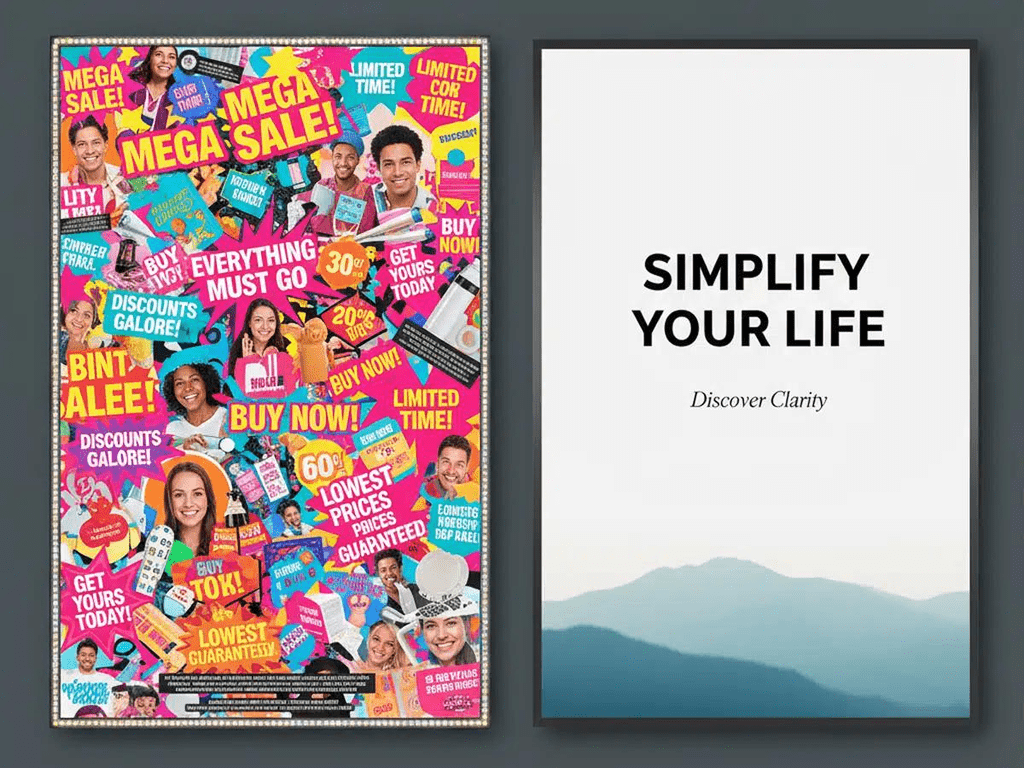
Because it stands out.
Think about how your brain reacts when you scroll through social media. You’ve seen thousands of beautifully designed advertisements. Perfect graphics. Perfect people. Perfect products. Perfect branding.
Your brain starts recognising these patterns.
And when your brain recognises something as an advertisement, it can automatically switch into “ignore this” mode.
But then you see something that looks different.
Maybe it’s a simple graphic. Maybe the image isn’t perfectly polished. Maybe the copy looks like something a normal person would have typed rather than something created by a marketing agency.
You pause.
You read it.
You become curious.
And suddenly, the advertisement has done the most important thing an advertisement can do:
It got your attention.
Think about a car dealership…

Imagine you walk into a car dealership and there are two salespeople waiting to help you.
The first is dressed to the nines in an incredibly expensive suit. His shoes are immaculate, his watch probably costs more than your car, and everything about him screams “professional salesperson.”
The second is wearing khakis and a basic button-down shirt.
Who would you rather negotiate with?
Who would you trust more?
For many people, it’s the second person.
Why?
Because the first salesperson looks like exactly what we expect a salesperson to look like.
And we’ve been conditioned to be cautious around salespeople.
We wonder:
Is he going to push me into buying something?
Is he trying to make as much commission as possible?
Am I actually getting a good deal?
The more polished and “salesy” something feels, the more our internal alarm bells can start ringing.
The average-looking salesperson, on the other hand, may feel more approachable, honest and trustworthy.
That’s the same psychological principle that can make simple, “ugly” advertising work so well online.
When something looks straightforward rather than overly polished, people may be less likely to feel like they’re being aggressively sold to.
But what about conversion rates?
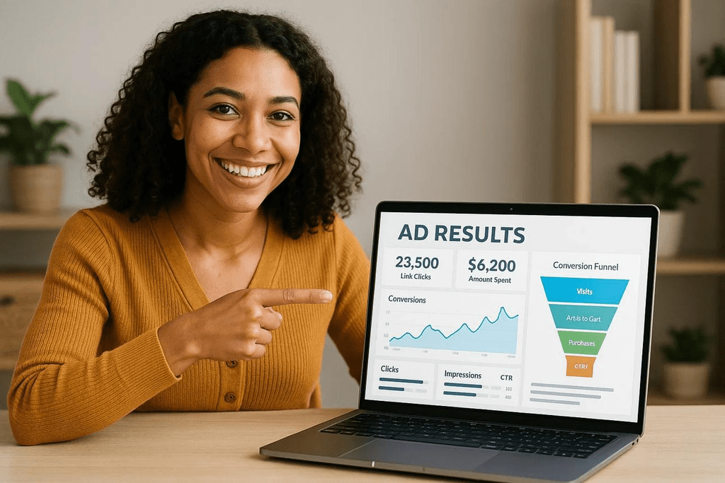
Let’s quickly make sure we’re talking about the same thing.
A conversion rate is the percentage of people who take the desired action after interacting with your marketing.
For example, imagine 100 people click on your advertisement and 1 person makes a purchase.
Your conversion rate would be:
1%.
As marketers, we often focus heavily on making our advertisements look better.
Better images.
Better fonts.
Better colours.
Better layouts.
Better branding.
But ultimately, the question isn’t:
“Does this advertisement look beautiful?”
The question is:
“Does this advertisement get results?”
I’ve learned this lesson myself.
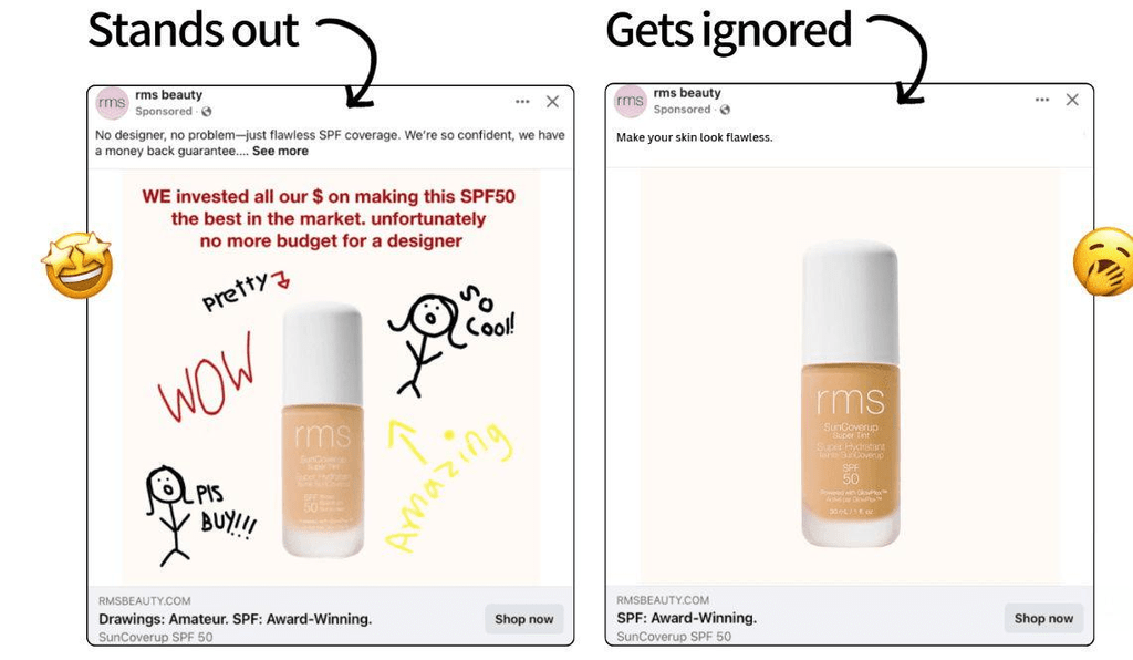
I have an advertisement that I’ve been running for around three years.
It isn’t the fanciest advertisement I’ve ever created.
Actually, if I’m being completely honest, my branding has evolved quite a lot since I originally created it, so the ad now feels a little outdated compared to my newer designs.
But you know what?
It absolutely CRUSHES IT.
It has one of the highest conversion rates of all my advertisements.
So why would I “beautify” it?
Why would I change something simply because I think it should look better?
If it is already converting, changing it could actually make it worse.
And that brings me to one of the biggest lessons in digital marketing:
Stop confusing pretty with effective.
Simplicity works.
Sometimes the simplest advertisement is the one that gets the best results.
It grabs attention because it doesn’t look like everything else.
It feels human.
It feels accessible.
It doesn’t immediately scream:
“I AM AN ADVERTISEMENT AND I WANT YOUR MONEY!”
And that can make people more willing to stop and actually engage with it.
The same principle applies beyond social media advertising.
When you’re writing emails, sales pages, lead magnets or funnels, don’t feel like every sentence needs to sound like it came from a professional copywriter.
Talk to people like people.
Keep your message clear.
Keep your language simple.
Focus on the problem you’re solving and the result you can provide.
And most importantly:
Test it.
Don’t assume something will work because it looks good.
Put it in front of your audience and look at the numbers.
Because at the end of the day, your audience gets the final vote.
The ugly ad might beat the beautiful ad.
The simple email might beat the beautifully designed newsletter.
The basic Facebook post might outperform the professionally produced graphic.
And the plain-looking sales page might generate more sales than the one you spent three days designing.
Marketing has a funny way of reminding us that what looks good to us isn’t always what works best for our customers.
So the next time you’re tempted to make your advertisement prettier, stop for a moment and ask yourself:
“Am I improving the marketing… or am I just making it prettier?”
Because sometimes, ugly really does convert better.